


eBooks are going to stay long come what may. They are the perfect combination of evolving technology and the history of publishing. They are just like us. Preserve old publications and keep them wrapped up for future generations.
Hence, e-books will become our legacy and all praise to the technology we developed in the process. With the great things we have on hand, Evolution does speak for humanity. Let’s take a look at what makes e-books outstanding.
E-Books include not just the content but also the way it’s presented and packaged.
Like any other commodity, you have to sell it properly. Addressing this question, why exactly do people want to buy an e-book, and The reasons we want to tackle this are multilevel.
- Obtain something more than physical books in terms of readability, usage, and experience.
- Technically strong, as eBooks offer new reading options. For example, zoom options, font and layout changes, brightness settings, The ability to share, and interactivity.
- Enjoy more for less. Access millions of free and paid e-books and carry them around wherever, and enjoy reading whenever you want.
- One of the crucial factors in buying an e-book is the ability to socialize. Sharing quotes, get people to read them, and recommend them. The possibilities are limitless.
Let’s dive in and look, how exactly, do you make your eBook stand out.
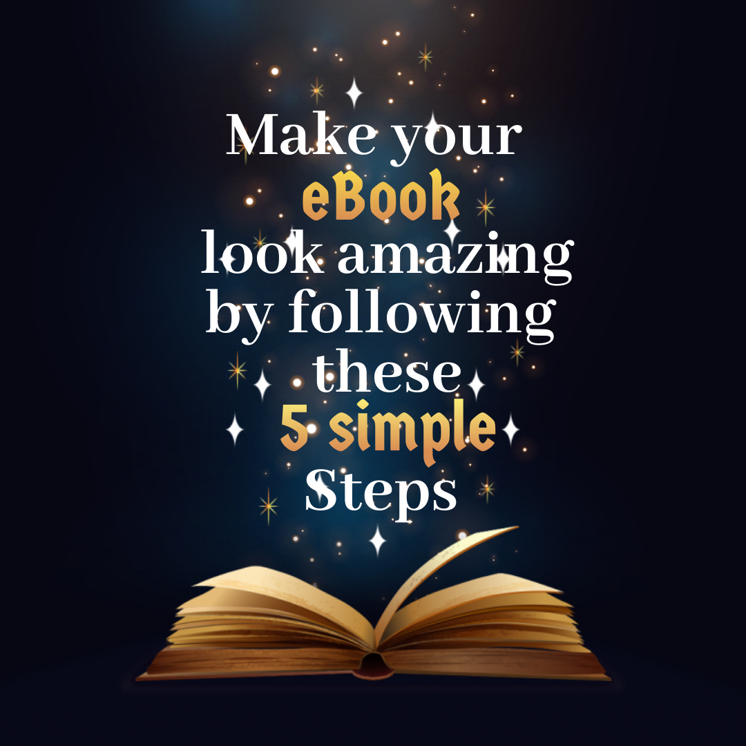
Place Your Best Foot Forward using our simple visual eBook Tricks
Exceptional content is one of the keys to e-Book success.
As we all know, content is king. There is no alternative to this. Write something that matches people, especially your reader’s expectations. The biggest win to an author is to keep readers constantly engaged with the content and taking enough care of their readers to move on to the next page.
You have to make the content very interesting, Be it your next great novel, material, research paper, or anything else. You have to live to the expectations.
Let’s say you want to publish a best-seller e-book and to achieve this. Firstly your e-book needs to grab the reader’s attention, generate potential leads, and finally drive leads deeper into the sales funnel. You can do this by providing extensive research on new industry statistics, trends, and metrics.
Statistically, e-books fall into two or three categories as Thrillers, Biographies, and self-help manuals. There is no substitute for original and exciting content.
However, if you’re a writer looking to get your next novel out, try to be as diverse as you can or stick to the formula that worked previously. Be careful with the content you produce and make sure it connects well with the readers. Try to focus on a group of readers and classifying their reactions to the story. See what they think of the material and where they are mostly getting disconnected. Improve them and make them very interesting. Getting a group of readers to read your e-book is a difficult task. Or else try preliminary manuscripts, Shorter excerpts, and summaries that will help you see the effect.
The question here is that all the information starting with statistics and figures, conversations, and theories are sufficient enough, and All they need is just the information, and why would they go for your eBook?
eBook Layout and Designing
Designing a great eBook is like a mission impossible. You have to try rigorously to make it look good. The design and user interface have to be exemplary. When it comes to an e-book, you cannot expect any excuses. The e-book is either good or not worth it.
Therefore, the design must attract and impress readers from the first moment. Now the question is, How can we achieve that? Are there any checkpoints that we must lookout? Of course, there is.
Below are few simple tips that might help!
Fonts that resemble your Thoughts
Choosing the font for your e-book may seem to be a bit challenging, but choosing the right font can improve or detract from your overall message. So a lot of focus is needed to select the right font for your e-book and use it persistently for all future e-books. Well, You know the standard for using fonts, but did you know that industry experts have banned few fonts?
- Comic Sans: The most widely used and yet generally despised font is Comic Sans font. A font that you can only use for your child’s birthday party. Don’t even think about using these fonts for your e-books. You are committing a satanic sin, even if you consider it.
- Copperplate Gothic: You can consider these fonts if your material speaks only on medieval culture and civilization. Never use these fonts, even when you are with no options.
- Papyrus Font: There are some fonts that we hate the most. And Papyrus Font is one of a kind. The entire community of writers and publishers completely rejects it.
- Gotham Gothic and Proxima: People won’t care at all about your work if these fonts exist somewhere. Do not infect your work using these fonts. Be practical. Go for simpler designs and delete these fonts even if you have them.
Here is the list of some contemptible fonts: Trajan, Lobster, Curlz MT, Brandon Grotesque. Never use it in an e-book.
let’s be very clear: if a font is trending, chances are you won’t need it anywhere in your book. The book must have fonts that are universally appealing.
Most preferred Fonts for eBook
The simple fonts that Kindle supports and uses for its e-books are all we want. Here is the list of all such fonts : Arial, Baskerville, Courier, Caecilla, Helvetica, Palatino, Trebuchet, and Verdana.
These fonts work best with e-book formats and give you the readability you desire with e-book readers. You can embed fonts of your choice in e-book but, this is not recommendable as many readers like to change the font of their choice on their Kindle device.
Use the fonts that best suit your eBook
When you are making a novel, your choices are easy. You need a font for the main text, and you need a font for the chapter heading. You can use the same font for both or two different fonts – it’s entirely up to you how best to convey your thoughts. The rule of the day is strangely precise: If you’re using two different fonts, the consensus among designers and typographers is not to use two serifs or two sans serif fonts.
Font: Text Bodies
The most commonly used body font for e-books is Georgia. It is a very legible font that does not try to impose itself on the readers.
The main goal of e-book typography is that the reader does not realize which font you are using. The logic is simple, The more he observes, the more annoyed he becomes, and at the end does not read the book at all. In this context, sometimes Palatino and Baskerville fonts are used to give crisp and clear essence to work.
Font: Chapter Headings
Now that we have a clear idea of what font we can use in the bodies of text. Let’s focus on The titles. We must take utmost care and obtain an initial reaction before the reader enters the dense forest of body text. If you use Georgia as a body text font, consider either Georgia or sans serif font for chapter headings.
We have a list of fonts that you can readily use. Verdana, Arial , Lucida Sans Unicode, Trebuchet and Helvetica. All these fonts have a great way to tell a story as they bring all of the fascination factor with them that is sure to go all the way to the end.
Font: Size and Shapes
One most rewarding thing is the space between lines and words, and it is worth it when it comes to e-books. Printed books are not so different from digital books.
You need to figure out the fonts, placements, and other technicalities to make for a great reading experience. Above all, you should be very careful with e-books.
Setting the single-lined spacing type is a universally accepted way for Books but makes it difficult to read, while double spacing is too much space, and One and a half line space is fine.
But with the new eBook readers, you get all the options for expanding fonts and spacing, etc. That doesn’t mean everything you’ve done with the layout counts for nothing. You can still provide a decent Frame by trying some font combinations and see what works for you, but keep it simple and don’t let the font get between the reader and the content.
Colours that define the e-book
Let’s say the e-book strives to meet industry standards. You need to use fonts and colours that reflect your thoughts. The logic is simple an average user has a clear idea of what the book is.
Of course, the user will expect some logos and designs that they are already aware of, for example, the deep maroon shade from Coca-Cola or the red and white combination from Airtel or Vodafone. A book on these cases would be abrupt and incomplete without using the red and white combination. The colouring connects on a deeper level, as experts called the intuitive power of writing.
If the book is about an organization, you need to be very particular about using the colours in your e-book similar to your company’s style guide. The appropriate component of your content library so that it aligns with your other marketing materials and content.
Page Layout
The last vital ingredient is creating the best eBook page layout. You have to be extremely cautious on how and when the elements of the book should appear in the book. Make the content flow easy and effective using bullets and italics, headings, sub-headings, etc.
The factor that justifies the elements on your page is emphasis. Do you want the reader to enjoy the flow, or should they pause for a while and think? Don’t go without a break. Cut it all down to well-read pieces of text. An immersive read of the eBook that all readers would love to read.
Unique Format
eBooks are not just digital books. They offer many advanced ways to tell a story. Check out the benefits below
- Online comics integrated with superhero videos
- Enhanced e-books give you the right music for the passage you read.
- Use e-books like Flipbooks that allow you to put images and text in the same layout.
- In addition, you will also have the opportunity to interact with the elements while reading.
- Another benefit of flipbooks is that some flipbook companies can give you a detailed analysis of who reads your e-book, what pages they read, and what content they have shared. It is an easy way to make your e-books stand out.
- Pop-up windows show you the meaning or context.
- Redirect/click to another related topic.
- Show the media that the texts represent.
- Compatibility: The types of e-books you can come up with are: Audiobooks, FlipBooks, Rich 3D Media Content, etc.
Illustrations and Images
Don’t upload the pictures for the sake of making the eBook look heavier. Just go with the content-relevant images.
An essential part of any best e-book is the illustrations and pictures are rightly incorporated next to the text. The images should support and reinforce the text message you want to convey. The visuals can be like diagrams, graphics, screenshots, illustrations, Pictures, and small infographics.
It is very crucial because the brain processes images and pictures 30,000 times faster than text.
This concept is vital because not all of the people who download your eBook will read its contents. Some will search it for key points, others will read it casually, and few will study it in detail. The pictures will helps this first group of people who want to scan the information and extract the key points.
Ultimately, these visual elements will help keep the reader engaged, support your message, and provide tangible examples of the concepts you want to explain. Try to include an image on each page of your e-book.