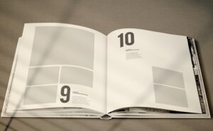
Book Layout Design – Most authors know that a comprehensive cover is a must when self-publishing a novel.
Regrettably, the inside pages (book’s “interior”) are seldom given as much care or attention.
 Book layout designs are special and not one-size-fits-all. it also must be tailored for the style and genre of the novel. A Great book interior is considered in two crucial areas: one is typesetting which deals with font, type size, space between the lines, and hyphens that break the lines & the other is the layout which deals with margins, columns, and illustrations, and art.
This blog will take you into components of both typesetting and layout design. If you hold these in mind and realize their value, your next book design layout will be victorious:
1) Trim size:
It is the first step to choose a standard size like 5.5 x 8.5 or 6×9, which is sufficient for the long chapters of a book or autobiography? Or maybe a wide art book to have a room for large photographs, for example, poems which will not break lines.
You’ll also want to determine whether you need a paperback, a hardback with a dust coat, or a casebound with the art indented right on the cover. Hardback and casebound books give higher production and transportation costs.
2) Margins:
Margins are possibly the most crucial part of a book layout design. A page has three margins like outside, top, bottom, and a gutter. Each of them has its significance.
The top margin is for the author, title, and page numbers. The bottom margin is for supporting the text block. The gutter aids the text not to slide into the glue area. Traditionally, these margins are narrow in size, while only the gutter is the largest.
3) Typography fundamentals:
Books are traditionally set in serif fonts like Garamond, Caslon, Baskerville and etc, for their smooth feel and for the comfort of reading. Whatever font you choose, it must compensate for book layouts and must have italics, semibold, bold, and small caps.
Also, white space between the lines, known as “leading” is crucial to avoid those lines packed together. Leading is inversely proportional to production cost, so you need to know how to play with that.
4) Running heads & feet:
The little lines at the top of the sheet that provides the reader all the info about the author, title, and chapter name. Seldom the page number will be at the base of the page, a “foot”, often used for bookmarking. Running heads and feet also produce a smooth visual frame to your text block. They must be compact enough to not impose on the text, while still readable and precise.
5) Art & Pictures:
If your writing has photos, pictures, or art of any kind, the layout must be planned to support them. Based on the genre, the lines and artwork will mix in several ways. For example, children’s books that need less text per page, and for a cookbook, you want a picture of the dish on the left, with a two-column recipe on the right. remember one great picture is usually more powerful than a collage.
6) Details of Signature:
It’s necessary to begin your chapters or parts deep called a “sink” to build visual cues for the reader and provide them a break before they fall into the new stuff.
A sink is a place for a design or artwork. Within the section, a charming graphic can be attached to define chapters and produce a visual gift to your page.
By implementing the above, avoid the common mistakes like “orphan” or “widow” pages, you will have a great book design layout out there. If you need any further deep pro tips, contact us.


